Last month I attended the 2016 Digital Methods Initiative Winter School led by Richard Rogers and his team at the University of Amsterdam. Organised in the format of a data sprint the event saw participants attend a day of keynote talks presented by the likes of, among others, Lilie Chouliaraki, Mathieu Jacomy, Carolin Gerlitz and Rogers himself before turning their attention to a hands-on digital project for the remainder of the week. With the rather clever title of, Otherwise Engaged – Critical Analytics and the New Meanings of Engagement Online the Winter School set out to problematize online engagement and develop new methods by which to measure, visualise and interpret that engagement. The group I joined, which was made up of Natalia Sanchez-Querubin (University of Amsterdam), Rik Smit (University of Groningen), Belal Islim (University of Amsterdam), Quentin Lobbe (Telecom Paris Tech), Gabriele Colombo (Density Design), Suzanne van Geuns (Utrecht University) Jasper Bol (University of Amsterdam), Lars Dellemaan (University of Amsterdam), Hadewieg Beekman (University of Amsterdam) set out to create a digital critical cartography of the so-called ‘Mediterranean Refugee Crisis’ (although this phrase formulation arguable shifts attention from the true location of the crisis in the Middle East) .
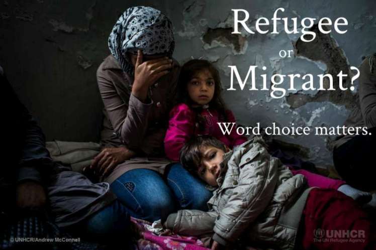
Our pilot study compared the maps, images, locations and texts returned by Google searches for the queries ‘refugee routes’ and ‘migrant routes’ in seven languages: Arabic, English, French, Italian, Dutch, German and Spanish. As we expected the result showed the different levels of empathetic distance, dehumanization and solidarity associated with the two terms (refugee and migrants) and reinforced the relevancy of the recent debates in the European press about the responsible use of these terms and the campaign by the UNHCR about the degree to which, in this context particularly, word choice matters. It would take too much space to explain in detail all of the different hybridized digital-human methods that we explored and used over the week not to mention all the multi-leveled findings suggested (but not necessarily confirmed) by our initial interpretive forays. So instead I direct those interested to visit our project wiki, which although still being updated, gives a good idea of what we got up to during the week.
There are a couple of things that I came across on my last day of working on the project which I would like to give more attention to here. As the group’s cultural geographer with experience in the methods and theories of critical cartography (some of the text used in the wiki on this subject is reworked from my PhD thesis and forthcoming book) – I helped with the mapping and interpretation of the borders of the top ranking maps returned by Google in order to demonstrate which geographies were most emphasised (this was then beautifully visualized as an accumulating heat-map by Gabriele Colombo). The initial results generally suggested that the subliminal geometries of the maps subtly reflected national interests while those associated with the ‘migrant’ query centred on the borders of Europe (although these borders were not always consistent) and those associated with the ‘refugee’ query were more likely to show origin countries like Syria and Iraq (I should stress that given our small sample sizes these suggested findings require further collaboration). One thing that was clear, however, was the death of maps returned by the Arabic language search terms (مسارات المهاجرين & مسارات اللاجئين). This led us to pursue a separate sampling strategy for these maps, which in turn produced a couple of telling insights.
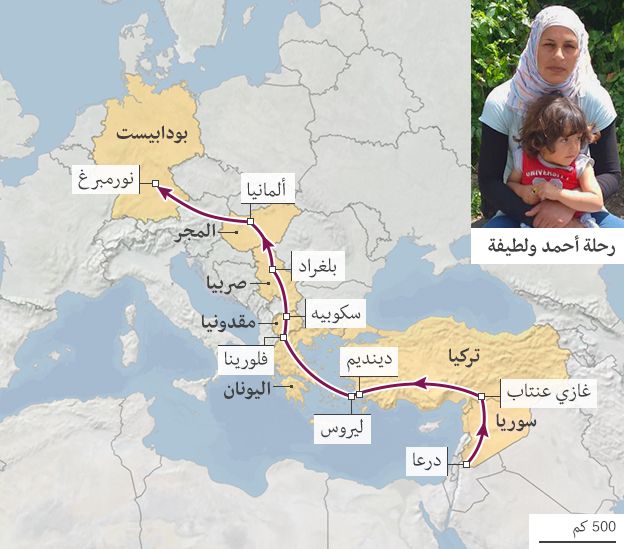
First, among those maps eventually returned for the Arabic language searches were the most humanized and respectful examples returned for the full sample across the seven languages. Published by BBC Arabic in July 2015 article, these maps show the routes taken by four individuals accompanied by a their photograph and personal testimonies. So far I haven’t found a translated version of this article on the English language BBC – and although I have come across the broadcaster’s impressive interactive Syrian Journey (also the result of BBC Arabic Digital Project) –the question still begs why not?
The second insight related to a series of screenshot, reused and re-contextualised maps appearing on a Syrian website that was offering advice to those preparing to make the trip to Europe. Discussion with the Syrian contingent of our team revealed that these maps showed the suspected location of unexploded ordinance dating to the Yugoslav wars of 1991-2001.
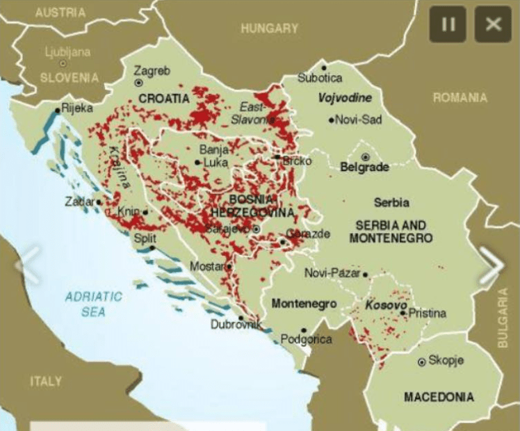
Here was reference to yet another threat that lined the overland route from the Middle East to Europe – a threat that has received close to no mainstream press coverage. True, over two years ago the Mines Advisory Group (MAG) flagged the risk of that mines and UXO posed Syrian refugees, in particular, not least with a rather sensationalist if informative info-graphic animation, but its warning’s related to the deadly remnants of conflicts in northern Iraq.
It is striking that those whose current plight is regularly compared to the individuals and communities displaced in the 1990s continue to face the same physical threats that their predecessors faced. Reminded of Gabe Moshenska’s writings about the dangerous material memory of UXO, it becomes clear that those arriving on Europe’s borders are not only fleeing conflicts in their countries of origin but also the heritage of those that took place closer to Europe over fifteen years ago. I have been told how many of these individuals experienced fear and anxiety in the Balkan region when they opted to leave roads and navigate through fields in order to avoid being picked up by the authorities and having greater chance of crossing boarders. The cynic in me wonders just to what extent UXO is really still prevalent in the Balkans and whether the fear of it is actually being harnessed to control the movement of those seeking to reach Europe.
Are these maps now out of date and do they contribute to decisions as to whether to risk the journey by sea instead of land? It is hard to know, but they do at least reveal a missing stretch in the journeys and a gap in the stories of those desperate to secure a safer and better future – a vacuum that if filled responsibly, whether with cartographic visualizations or something else, I hope will only increase Europeans’ levels of empathy and solidarity for those arriving in and traveling to their countries.
